A bold new design language that establishes Motorola as a player in the premium smartphone space
Company
Motorola Mobility, Inc.
DEsigned
2023–24
Role
Creative director
Principal designer
Design system architect
―
As Design Director for Motorola's Consumer & Experience Design team, I led the strategy, design, and rollout of a new global design system that launched on Motorola’s 100-million+ active devices.
Launching in March 2024 with the Motorola Edge 50 Pro, the “Hello UI” design language created a premium and differentiated identity for our software experiences, enhancing the brand presence on device and establishing a unified global system to ensure consistency, efficiency, and adaptability.
Insights
In late 2022, research had highlighted three things:
Users trusted Motorola, but didn’t know what we offered
They often attributed our unique, well-loved features to AndroidOur existing branded UI and color palette was viewed favorably
However, the execution was inconsistent across apps, regions, and productsOur image strategy felt dated and needed reinvention
The illustrations no longer matched the rest of the brand and didn’t communicate clearly enough
A sample of Motorola’s previous design language (2021–24)
Background
Motorola had long been positively associated with Pure Android – a clean, unencumbered OS with limited customization and no bloatware. However, when Google released its own Pixel devices in 2016, Motorola’s value proposition became more difficult to defend. Motorola was well-established in the global smartphone market (#2 in Latin America, #3 in the US), but there was a need for major growth in the Chinese market, where Pure Android was seen more as a liability than an asset. These and other differences in consumer preferences and expectations between China (PRC) and the rest of the world (ROW) had caused a split in design strategy and resources, resulting in two completely separate design systems, often coexisting on our globally shared devices.
Strategy
Based on these insights, we identified the need to establish a premium and differentiated product with a clear brand presence, and design and build a single, unified design language and system that could be embraced globally.
Distinct
All digital experiences would need to feel unique, memorable, and distinctly Moto. We would offer delightful experiences without the bloatware.
Integrated
The phone should feel like a Motorola phone, top to bottom. Tasteful and seamless integration would be a key to success.
Yes, and…
We would extend and build upon the best parts of Android rather than duplicate. We might polish, but we wouldn’t change for the sake of change.
Leading, not following
We would design from first principles supported by research. We might reach similar conclusions as the competition, but we wouldn’t copy.
Principles
Human
Thoughtful, relatable, nuanced
Value through connection
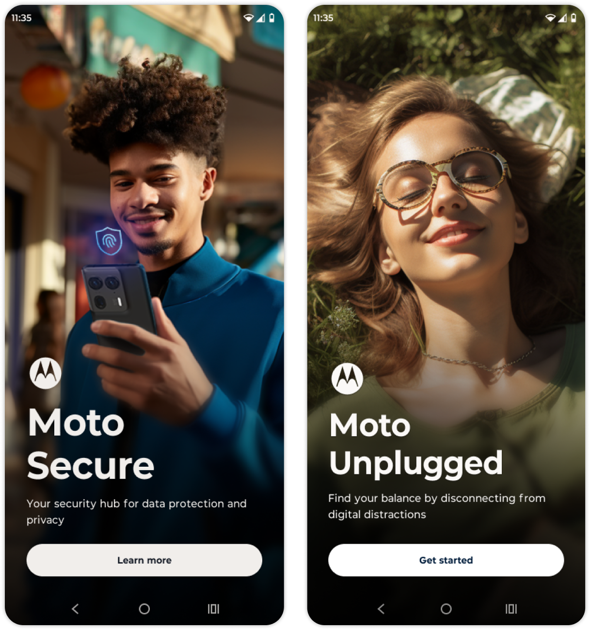
We show real people in real situations using technology to make their lives easier. We never use illustration to depict human elements and any AI or CGI should show people that are relatable and represent our diverse, global consumer. Subjects should feel down-to-earth, not aspirational or overly staged. Image tones are warm and welcoming.
Confident
Bold, self-assured, optimistic
Guiding the way
Go bold and don't flinch—bold type, bold hierarchy, bold scale. We use high-contrast design to show users what's most important on the page. We aren't afraid of white space. We let content define the page structure whenever possible. Only add extra visual elements when necessary for usability or when the content cannot establish the page structure on its own.
Authentic
Honest, familiar, accessible
Premium but never pretentious
We are authentically, thoughtfully, and unabashedly digital. We design for a world of digital natives by using space, shape, and shade to create a sense of depth and place within the digital world. Our software shouldn't pretend to be something it is not.
Crafted
Detailed, attentive, evocative
Created for humans by humans
We pay attention to the small details to deliver small, but powerful moments of delight. Be it an illustration, micro-interaction, or copy string, each design decision is made with care and contributes to an experience that feels tailor-made.
Project timeline
The entire process from kickoff to launch took just over a year with initial concept development beginning in March 2023 and the final revamped design system launching in full on the Motorola Edge 50 Pro the following March.
Concepting & Research
Starting in March 2023, we organized three teams of three designers across the US, Brazil, and China, each tasked with coming up with three unique UI and graphics concepts that could be put into a global survey of users. Each concept consisted of 6 screens representing various user touch points across the device.
Concepts
Concept 1
Friendly and approachable with bold, yet nuanced surfaces and playful graphics
Concept 2
Clean and reliable with high-contrast surfaces and technical illustrations
Concept 3
Sophisticated and editorial with dynamic surfaces and photo-based graphics
Objectives
Our user research aimed to get an understanding about the user's perception on each of the new concepts: how visually appealing it is, how easy it is to understand, and what they liked about it. The research plan also set out to suggest improvements on the concepts, and identify which of the proposals best fits the Hello UI design strategy and vision.
Methodology & testing
The research was conducted via an online survey with 800 users across 8 countries (US, UK, India, China, Brazil, Mexico, Argentina, Poland, Italy) with mixed ages (18–55), genders (50/50 male/female), and smartphone brand ownership (Apple, Motorola, Samsung, Xiaomi).
The survey asked each participant a series of open questions, asked them to select from a list of qualitative words that they felt described each concept, and then asked them to rank each concept based on their preference.
Findings
Concept 3 was top ranked globally
Participants identified Concept 3 it as the most modern, innovative, bold, and attractive. It also skewed slightly younger and female when compared to the other concepts. Concept 2 was considered simple and fresh, but also basic and boring. Participants thought Concept 1 was thoughtful and easy to use, but less innovative and engaging.
System foundation
Following the research findings, we started from the ground up, reconsidering our brand palette, typography, icons, and graphic strategy.
Color
The Hello UI color system ensured our brand colors were optimized for digital interfaces by placing each color within a full range of tones using the HCT color model, which standardizes saturation and brightness for consistent contrast within the UI.
In order to avoid the overly pastel feel of standard Material Design, we created a single custom range of neutrals we called Vellum. Vellum transitions from warm natural hues on the lighter end of the range to cool blue-gray hues on the darker end. Allowing the user to change the device accent color while controlling the neutral tones allows us to maintain personalization options and still ensure that the device feels sufficiently Moto.
Icons
Colorful, cohesive, on-brand app icons
We redesigned our app icons to make finding an app easy and to evoke the Motorola brand when it’s most important. We leveraged a set of dynamic interpretations of each brand color using gradients made of two hue-shifted points that maintained the color’s tone and overall average hue. This allowed us to add subtle dimension to the app icons without tipping into skeuomorphism.
Rounder, Friendlier, more balanced System icons
The Hello UI system icon set included more than 500 custom icons with each icon available in both outlined and filled styles across 4 optimized sizes that maintained optical balance as the icon scaled. This icon set was used in place of Material Design in Motorola experiences, however we followed some basic Material guidelines to ensure they did not clash with the broader Material set used across Google and many 3rd party apps on the device.
Typography
Previous versions of Android used Roboto as the default font. With Android 12, the Pixel moved to its proprietary Google Sans font as the default. In 2022, to bring a more custom, branded feel to Motorola’s OS, I had designed a custom typeface just for Motorola UI, called Rookery, that straddled the line between Google Sans and Gotham, Motorola’s licensed brand font. For Hello UI, I refactored the original font, redrawing several glyphs and updating language support. We published this revamped incarnation as Rookery New.
Creating Rookery new
Rookery New is a modification of open source typeface Montserrat, a modern geometric sans serif that shares many common features of Gotham. However, Montserrat has a few distinctive quirks that were not optimal for our UI applications and don’t align as well with the Motorola brand aesthetic. The G, J, Q, 3, 4, 6, 7, and 9 were modified, kerning pairs were adjusted, and the entire character set was condensed slightly to account for density of information and to ensure that localized strings didn’t break unexpectedly.
Graphics
Our graphics approach used a combination of real imagery and illustration to guide users through experiences and highlight the value of various features.
Real imagery
Photography and realistic AI-generated images or CGI are used to show the human side of experiences, to show people interacting with technology, or to highlight the value of a product or feature. People and situations should be relatable to the global consumer rather than cold, aspirational, or staged.
Illustrated graphics
Illustration is used to represent abstract relationships, generalized concepts, or to keep focus on the UI. Illustrations can be as simple as a stylized icon or as complex as a detailed UI animation.
Moments
A settings screen, an app launcher, and a tutorial all need to accomplish different things. Each exists within a different mode of thinking and comes with a different set of user expectations. We took this into account by designing within moments.
Discover
User goal
Explore features and take action
Visual qualities
Impactful, editorial, image-driven
The Discover moment utilizes editorial-inspired layouts to show users the value of an experience, teach them how to use a feature, or raise awareness. Images and impactful typography keep storytelling concise, yet effective.
Launch
User goal
Find and enter experiences
Visual qualities
Atmospheric, immersive, infinite
The Launch moment gives the user a sense of place and offers entry points into distinct experiences and features. Boundless layouts with a sense of depth orient users and a consistent directional metaphor makes navigation more intuitive.
Configure
User goal
Adjust settings and enable features
Visual qualities
Minimal, high-contrast, uncluttered
The Configure moment is where users adjust system or in-app settings, make selections, and enable features. Bold, streamlined layouts with clear hierarchy optimize information processing and allow the user to focus on their desired action.
The result
―
In just over a year, we went from concept to launch, touching nearly every aspect of the device with a team of fewer than 5 designers dedicated to the endeavor.
Research showed an overwhelmingly positive reception. An unheard of 99% of global dogfooders (internal testers) agreed that Hello UI looked fresh and modern, was intuitive, and improved brand awareness.


